
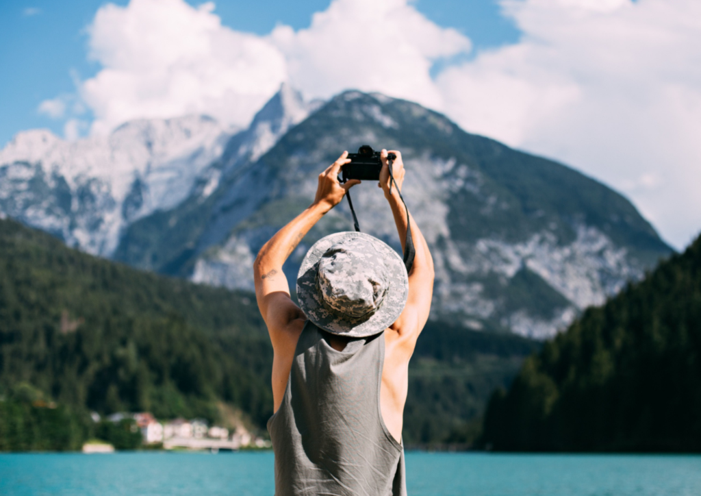
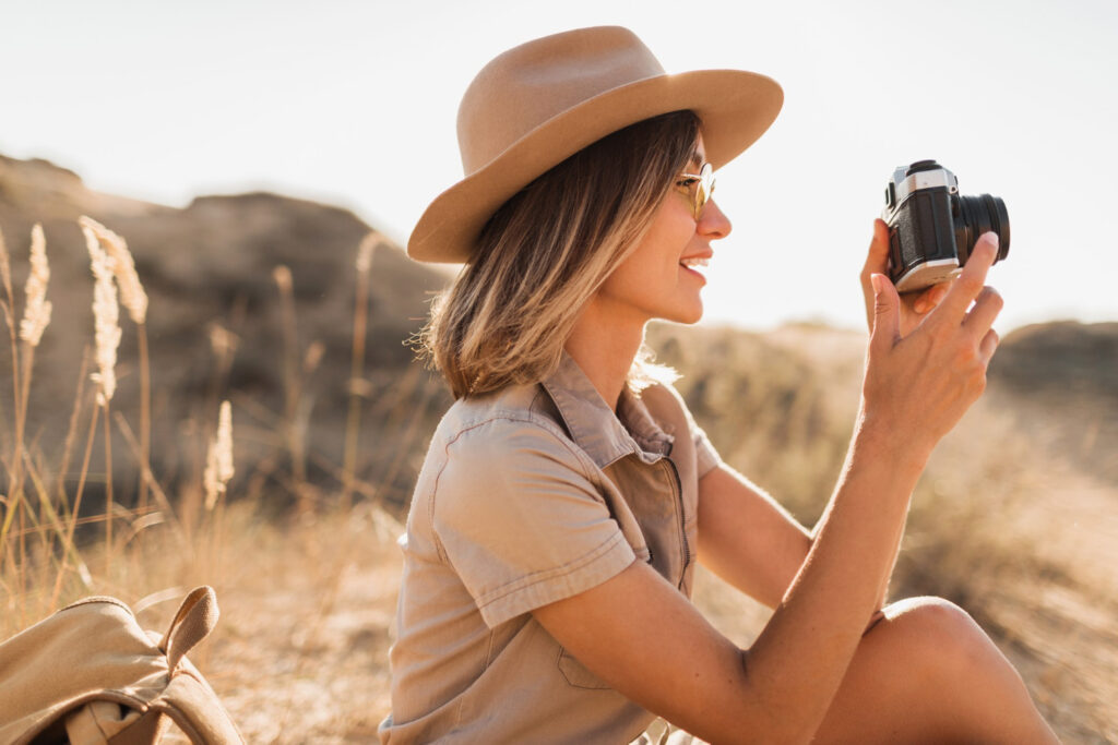
We’ve all been there. You return from an incredible trip. Your camera roll is bursting with beautiful shots. There’s the perfect sunset over the ocean, the candid laugh from a street cafe, the majestic mountain peak. You go to post them, but something feels… familiar. They look exactly like the travel photos everyone else posts. They’re nice. They’re clean. But they don’t quite scream your specific adventure. They’re missing a piece of the feeling you had when you took them.
If you’ve ever wondered how to add sticker to a photo, you’ll be glad to know it’s easier than it sounds. Modern editing apps and software make the process quick, intuitive, and accessible to everyone. With just a few taps or clicks, you can transform a regular travel picture into a unique and vibrant story.

Why stickers work
Photos freeze a moment. Stickers point to the heartbeat inside it. A small sun near the horizon adds warmth you felt on that beach. A bold arrow next to a street sign shows the rush of a city sprint. These cues steer the eye and set the tone. The result looks alive and personal.
Stickers also create rhythm across a set. Repeat a color, a shape, or a tag. Your gallery turns into a series with a voice. That helps you stand out in crowded feeds.
The tools that make it easy
Most editors now handle stickers well. You do not need a pro setup. You just need a clean workflow and a few smart features.
- Mobile apps: Look for easy packs, layers, and opacity control. Batch export helps if you post a series. Popular picks have blend modes and smart cutouts.
- Desktop suites: Go for layers, vector stickers, masks, and colour match tools. You can tweak shadows and edges with more control. File presets save time for different platforms.
- Browser editors: Great for quick work. Drag, drop, resize, and export fast. Many offer free packs and transparent PNG support.
- Camera-native tools: Some phones ship with sticker stores and AR icons. Good for on-the-go edits right after a shot.
Tip: Import your own PNGs with transparent backgrounds. That unlocks unique sets you can reuse.
Styles for different trips
Not every sticker fits every trip. To make your photos look thoughtful rather than random, match the sticker style to the setting and mood of the travel experience.
- City adventures: Neon accents, bold arrows, transit icons, and typographic stamps. Think subway lines, street-art doodles, and date chops. A little grit works. Keep edges sharp and colours loud.
- Nature hikes: Hand-drawn leaves, mountain icons, and soft watercolour swashes. Use earth tones and gentle lines. Let the photo breathe with space. Calm beats clutter here.
- Beach days: Sunbursts, wave lines, shells, and pastel gradients. Warm yellows and coral pinks feel right. Place stickers near the sky or sand, not over skin tones.
- Mountains and snow: Snowflakes, altitude badges, and clean geometric frames. Cool blues and crisp whites fit the air. Add subtle texture to echo frost.
- Desert and road trips: Retro motel signs, route markers, and heat-haze accents. Lean into warm oranges and sun-faded teal. Grain overlays enhance the vintage tone.
- Art and museums: Minimal lines, thin frames, and serif date tags. Monochrome or duotone accents add class. Do not steal focus from the piece.
- Nightlife: Glows, sparkles, and chroma flares. Electric blue, magenta, and gold pop in low light. Keep placement tight to light sources.
Mix no more than two styles in one photo. Harmony beats novelty.
Composition and craft
Good stickers feel like part of the shot. Aim for balance and flow.
- Placement: Keep faces, eyes, and key details clear. Edge placement feels natural and avoids clutter.
- Scale: Start small. Increase size only if the frame needs weight. Large stickers work best as backgrounds or frames.
- Colour match: Sample a hue from the scene. Echo it in your stickers. Harmony reads as taste, not noise.
- Depth: Add a soft shadow or a slight blur. That sets stickers into the space. Do not overdo effects.
- Texture: Pair glossy icons with smooth skies. Use paper or grain near rough surfaces. Contrast adds interest.
- Motion cues: Use lines or arrows to guide the eye. Point toward action, not away from it.
- Words and dates: Short beats long. One tag or date stamp can anchor the story.
Less is more. If a sticker does not help the story, remove it.
Common mistakes to avoid
A few traps can dull the impact. Skip them and your edits will shine.
- Too many stickers: Clutter hides the story. Use restraint.
- Covering subjects: Do not block faces, hands, or signs that matter.
- Random packs: Mixed packs can clash. Stick to one set per post.
- Low-res assets: Blurry edges look cheap. Use high-quality PNG or vector files.
- Clashing styles: Kawaii icons on a solemn memorial scene feel off. Match tone to place.
When in doubt, remove one element.
Your voice, your map
Every trip leaves a trace. Stickers help you mark it with heart. They point to the laughter in a rainstorm and the hush at dawn on a ridge. They turn snapshots into chapters you can share with pride. Pack a small set, keep your rules tight, and let your photos speak. Your feed will feel like a place, not just a list.